New functionality for buying sets

Re-imagining how sets are displayed and sold, creating a new system to be used for all 14 brands with £2.25 Billion revenue

Project duration: 5 months

Project role: Design lead

Team: 2 FE + 2 BE + 1PD

Problem statement to solve

I’m currently the Senior Product Designer at Waggel, where I’ve worked on a range of projects aimed at making our product more efficient and boosting conversion rates. I’ve also spent time helping the team work more smoothly together and supporting junior designers as they grow in their roles.

Overview

An example of the older versions of the set builder

Across Boohoo Group fashion sites, product sets were visually promoted but functionally fragmented, creating friction for users attempting to purchase complete outfits. Customers were required to interact with each item separately, leading to lower engagement with individual products and a disjointed buying experience.

The existing model had reached its limit. It showcased collections effectively but failed to support seamless set purchasing, restricting both usability and commercial potential.


This project reimagined how product sets are presented and sold. The goal was to create a unified, single-page experience that enabled easy set purchases while retaining flexibility at the product level.

Before design began, we defined clear objectives for the sets system—
including functionality, placement, target users, and scalability across brands and platforms. This was shaped through cross-brand stakeholder collaboration, performance insights from the analytics team, and independent research. With no existing competitor solutions and a clear alignment between user and business goals, we moved forward to design a system built specifically to solve the problem.

Discovery and research

As this was a bespoke concept, there were no direct competitors to reference, meaning discovery relied entirely on internal research. We gathered insights through stakeholder interviews, data analysis, and first-hand customer feedback, exploring how users currently interacted with product sets and where friction occurred.

These findings helped define what the set builder needed to do, how it should behave, and the constraints we would need to design around. A key consideration was ensuring the experience worked seamlessly across both web and app, introducing additional complexity as the system had to be implemented by two separate development teams using different interaction frameworks.

This project reimagined how product sets are presented and sold. The goal was to create a unified, single-page experience that enabled easy set purchases while retaining flexibility at the product level.

Based on these insights,
we created a feature prioritisation framework, clearly defining core functionality, secondary enhancements, and technical constraints to guide design and development.

Must have

Must have

Expected

Unexpected

Creating the flow

Before design began, I defined the end-to-end set builder flow —how it functions, how users interact with it, and how the experience translates seamlessly across web and app.

Concept iterations

The initial concept aimed to create an immersive set builder that guides users through selecting and completing their sets from start to finish. Users can choose the number of items they want in a set and complete the process at any point, with the option to opt out if desired.

The set builder offers a step-by-step experience, allowing users to select sizes for each item and review a final set page displaying all chosen products. Users can modify selections, exit to the set’s PDP, or add all items to the cart, making the purchase process seamless and flexible.

Unexpected

Key solutions

Onboarding

Onboarding was a critical consideration for this new system, as it introduced interaction patterns users—both new and returning —would have no prior familiarity with. With no existing mental models to rely on, the goal was to provide guidance without slowing users down.

The onboarding experience was intentionally designed to be lightweight and optional. It surfaces only on a user’s first visit (and for a limited two-week period), and users can exit at any point—supporting those who are already confident or simply in a hurry.

By breaking onboarding into contextual sections tied directly to areas of the page, the experience avoids overwhelming users and remains easy to scan. This approach ensured key information was communicated clearly while respecting users’ time and differing levels of familiarity.

Individual purchases

While the primary goal of the product was to encourage purchase of a complete set, enforcing this too rigidly risked limiting user choice—particularly when users discovered an item they wanted to buy on its own.

Because the set-builder flow required a high level of user involvement, any deviation needed to be carefully placed to avoid disrupting momentum. For this reason, the option to purchase individual items was positioned at the start and end of the journey, where users naturally make decisions, rather than mid-flow.

This approach allows users to buy single items without being removed from the broader set experience. They retain access to the full builder at any point, while benefiting from the same functionality and clarity expected from a standalone product page—preserving flexibility without compromising flow.

Set purchasing

As the core functionality of the product, this experience needed to feel seamless and intuitive from the very first interaction. The design was intentionally embedded within the page so it felt like a natural extension of browsing, rather than a separate or disruptive flow.

The solution combines a guided journey through all available options with the flexibility for users to move freely between sections. This allows users to either follow a structured path or jump directly to the areas that matter most to them, completing a set at their own pace.

A summary page at the end of the flow provides a clear overview of what the user has built, giving them the opportunity to revisit any missing elements. It also surfaces total cost at a key decision point, helping users assess whether the set meets their budget—or whether they are comfortable adding an extra item—before progressing.

Result and impact

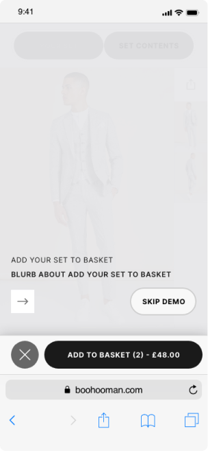
The full user impact of this project has not yet been measurable, as development was paused before the redesigned site could be released. From a delivery and alignment perspective, however, the project was successful, receiving full cross-functional sign-off from all stakeholders involved.
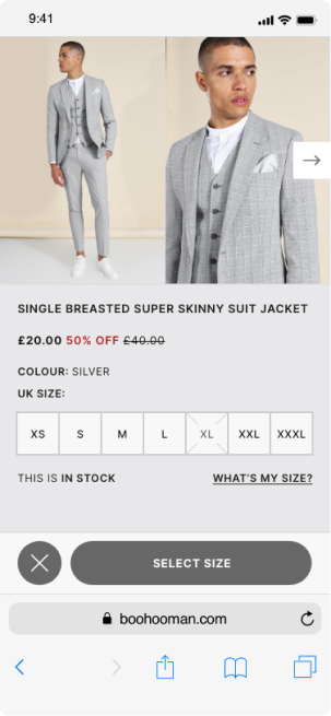
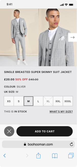
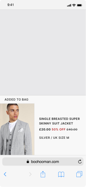
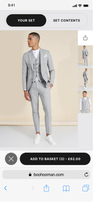
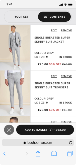
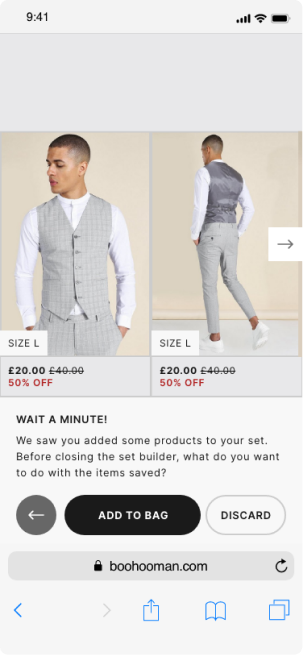
While the complete redesign has not gone live, elements developed as part of this project have already delivered measurable impact elsewhere within the group. The redesigned checkout experience, originally implemented on boohooMAN in late 2021, resulted in an 8% increase in conversion rate and a 20% reduction in drop-off, validating the design principles and user-led decisions applied throughout this work.
The intended next step was to collaborate closely with engineering to build and A/B test the redesigned experience. Although this phase did not proceed, learnings from this project have continued to influence other initiatives across the group. Insights and design hypotheses have been incrementally refined through related testing, ensuring the work remains relevant and performance-driven should development resume.
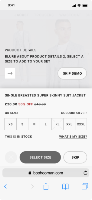
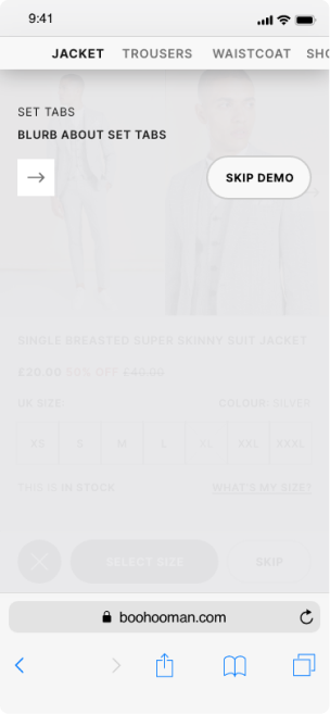
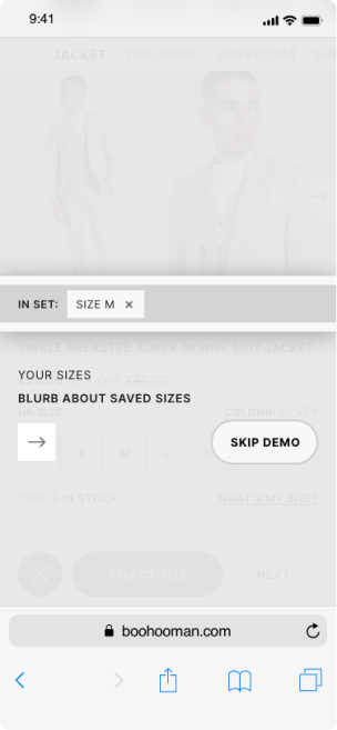
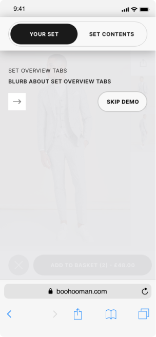
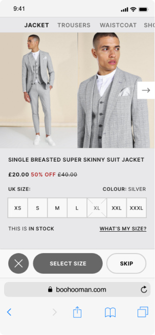
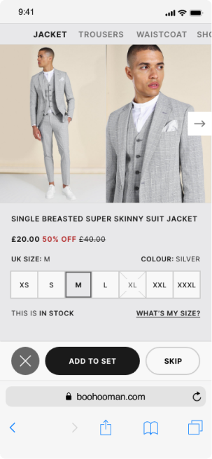
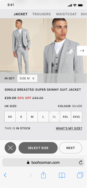
Reflecting on the project, the redesign delivered a significantly more brand-aligned and user-centred experience, with clearer purpose and functionality across all sections of the site. There were opportunities to push certain concepts further; however, stakeholder constraints meant some of the more progressive ideas were earmarked for future experimentation. In hindsight, the account area presented the greatest challenge, and with additional time, a more scalable solution for managing complex form-heavy interactions could have been explored.

Final designs

Onboarding

Set Builder

Summary