Doing a deep in how users from different sources interact with the most popular and important page and re-defining their goals by redesigning the page.
Problem statement to solve
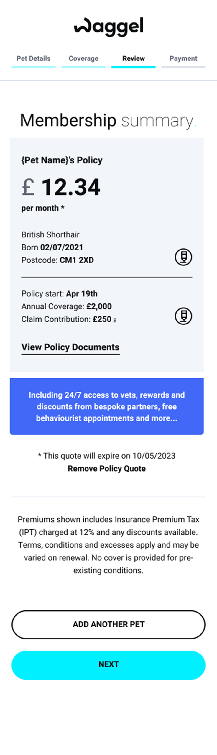
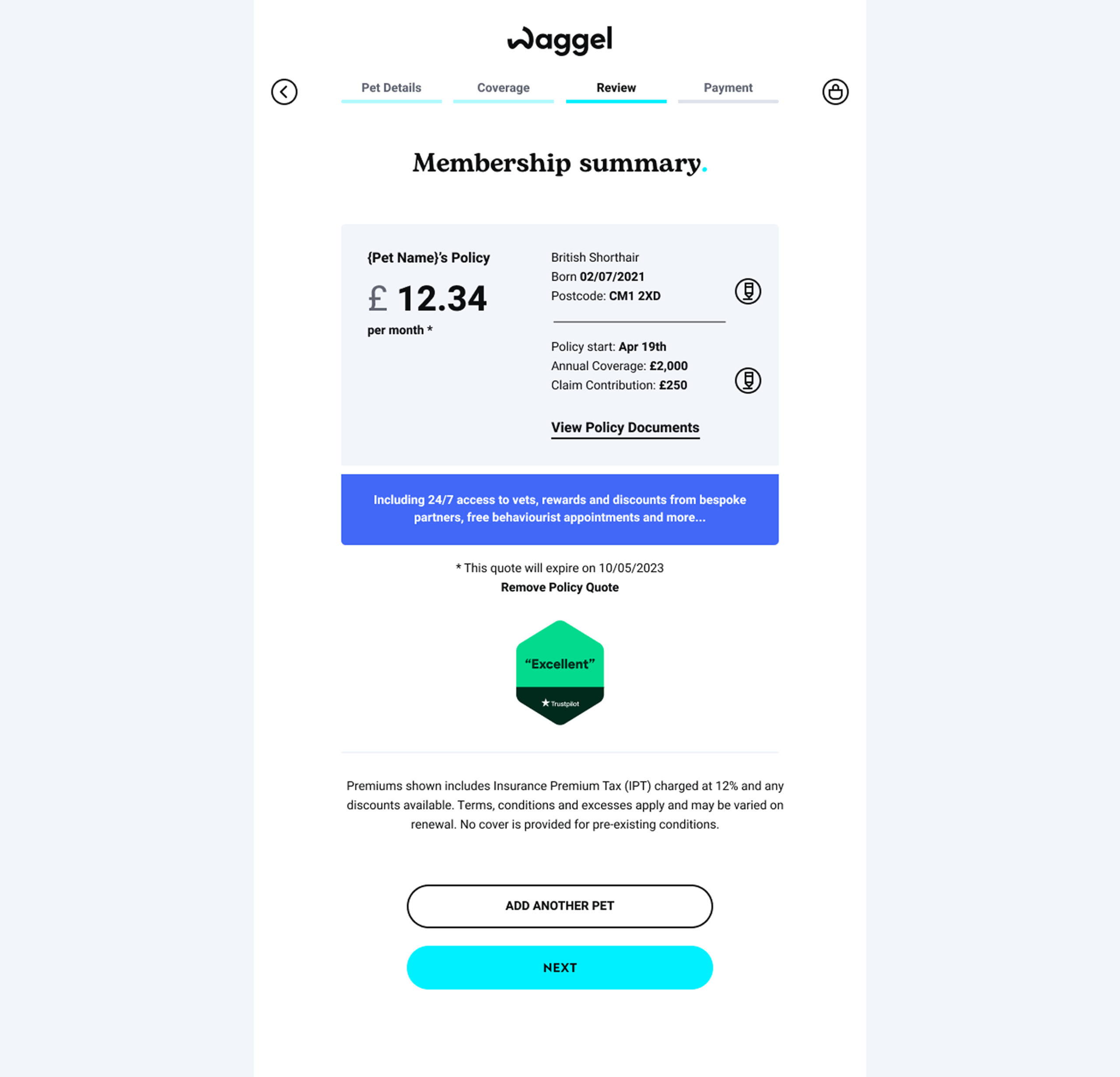
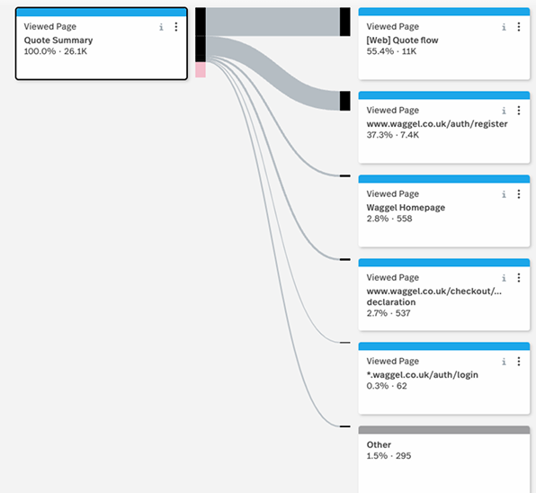
“The existing basket page, which served as a primary entry point for users from multiple acquisition sources, failed to support conversion due to a repetitive, quote-focused experience, limited relationship-building elements, and a lack of clear mechanisms to guide users toward meaningful engagement.”
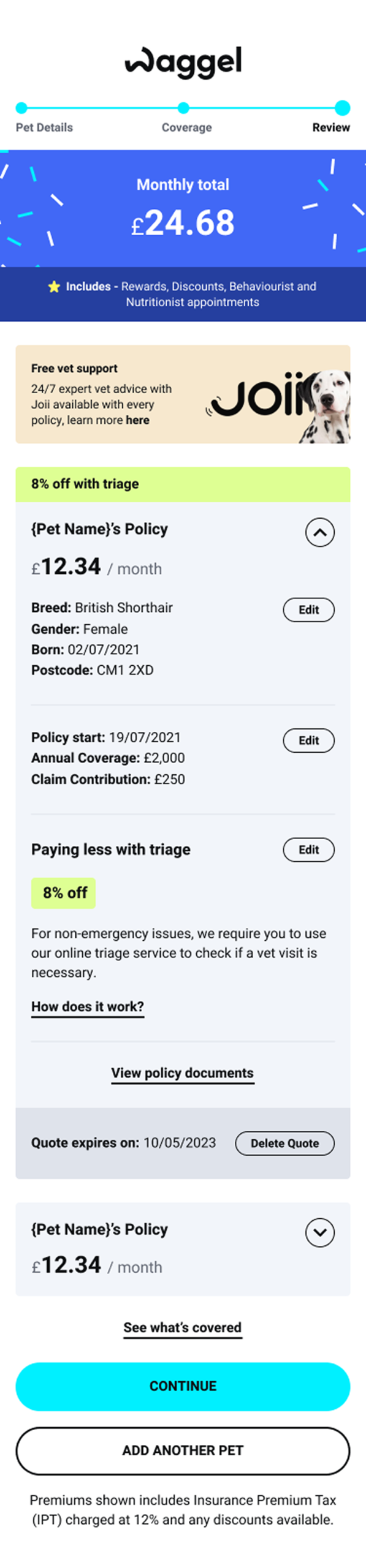
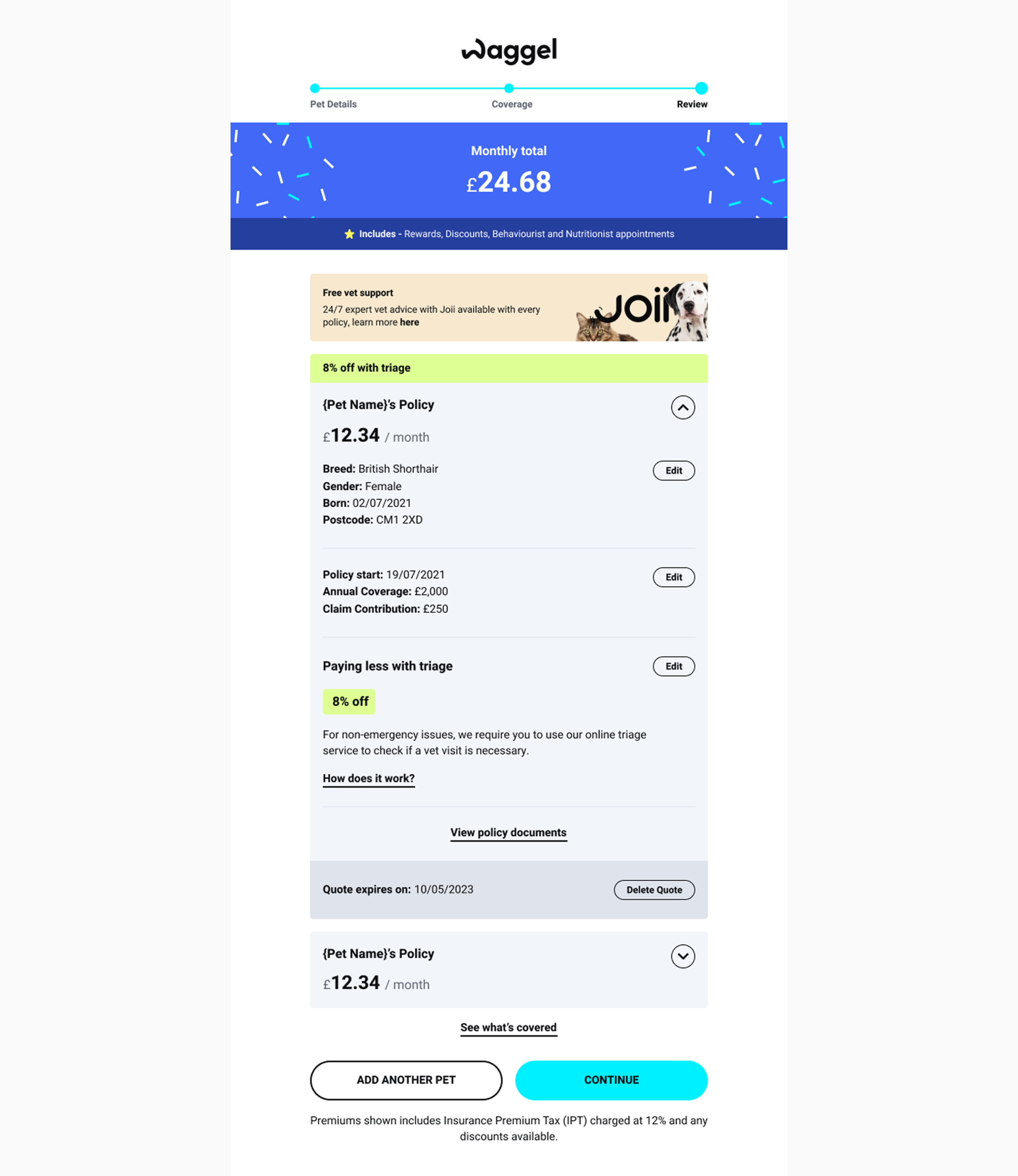
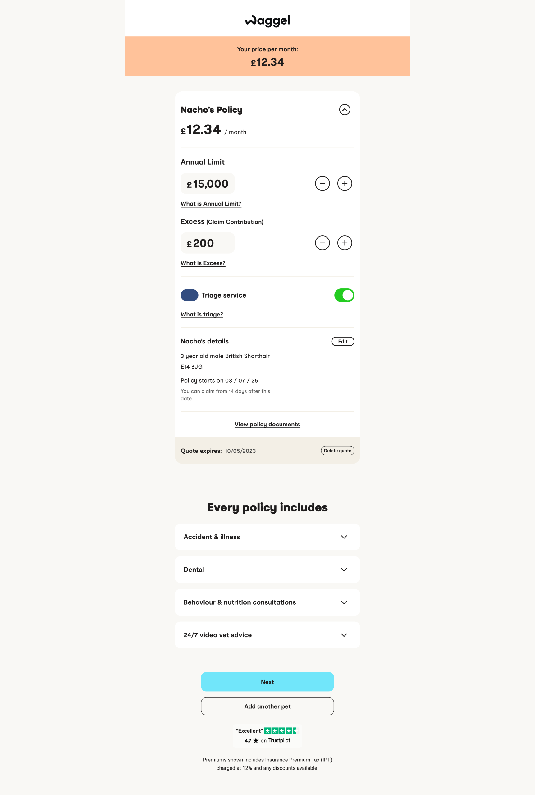
Each section of the quote now allows users to quickly jump back and forth to the specific area they want to amend, removing the need to recreate an entire quote for small changes. This interaction was designed to support iteration while preserving the integrity of the overall quote structure.
Embedding this functionality within the quote breakdown enables the page to present the quote as a near-finished product, reinforcing user confidence, while still allowing controlled flexibility. This approach also addressed a key technical constraint: full inline editing was not feasible, so navigation-based editing provided a practical alternative without compromising usability.
Despite being a relatively small interaction change, this update led to a 30%+ increase in quote retention, demonstrating the impact of reducing friction at critical decision points.
15% – In quote retention
55% – In CTA exposure rate
25% – Decrease in drop off rate
30% – Decrease in deleted quote
2 minutes – Decrease time on page
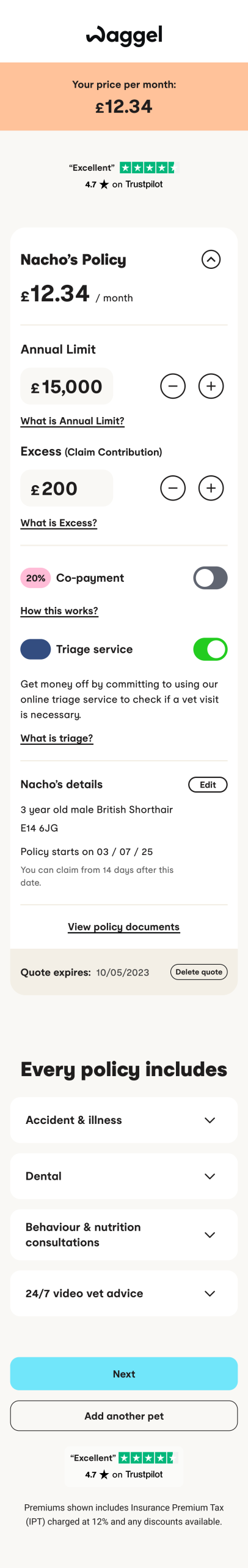
While the redesign retained all of the core information from the original experience, it presented it in a more responsive and editable format. This improved usability without compromising the clarity or completeness of the content.
Following the release of the second version of the redesign, performance improvements were clearly reflected in user behaviour. Aggregator traffic saw a 10% increase in conversion, indicating a more effective and streamlined user journey.
At the same time, the recycle rate to the rest of the site decreased by 60%, suggesting that users were able to complete their journey more efficiently without needing to navigate away. This highlights the impact of reducing friction and improving clarity within the basket experience.

Gathering clean user data post-launch proved more challenging. Shortly after release, the site experienced a significant increase in bot traffic that lasted for approximately three weeks, which distorted early analytics. To work around this, I relied on user ID–based tracking and built custom dashboards to isolate genuine user behaviour and measure the impact of the redesign accurately.
Based on data collected three weeks post-launch and analysed over the following eight weeks:
• Organic traffic conversion increased by 18%
• Users arriving via aggregators converted 12% better,
bringing their conversion rate in line with organic traffic and removing a long-standing discrepancy
• 20% increase in users engaging with free extras included in their policy (measured from users who completed checkout using the new basket)
• 40% reduction in customer support enquiries related to policy coverage
• While not directly measurable, GoCompare and MoneySuperMarket independently reported an improvement in our ranking following the redesign