MAN complete

re-design

A redesign of the current CMS template site, to transform it to a bespoke brand site. Matching the boohooMAN brand, focusing on the users experience and conversion rate.


Project duration: 11 months

Project role: UX lead

Team: 2PM + 7 FE + 4 BE + 2 QA + 1UXD + 3 UID

Problem statement to solve

The existing templated site architecture across Boohoo Group brands compromised brand expression and user experience due to over-optimised, piecemeal CRO modifications, resulting in fragmented interfaces and brand-specific issues that could not be effectively resolved within the shared framework.

Overview

Over time, many of the sites within the Boohoo Group had evolved from a shared e-commerce template that had been repeatedly tested and adjusted by the CRO team. While these optimisations were effective in isolation, the cumulative changes resulted in experiences that felt fragmented and overly engineered. As a result, brand identity and personality were diluted, and individual sites developed unique usability issues that could not be meaningfully resolved within the constraints of the shared framework.

The boohooMAN site was a clear example of this limitation. Built on a template designed to serve multiple brands, it lacked a distinct, own-able identity and the flexibility needed to support both the brand’s ambitions and its users’ expectations. Incremental optimisation was no longer enough; the site had reached the limits of what the existing structure could support.
It became clear that a full redesign was required. The goal was not only to create a bespoke, brand-led experience for boohooMAN, but also to rethink core e-commerce patterns—pushing beyond standard conventions to deliver a more distinctive, engaging, and commercially effective experience.

Discovery and research

The discovery phase focused on aligning stakeholder goals with data-driven insights to define a clear direction for the redesign. We began with stakeholder interviews across the boohooMAN team, including Ecommerce, Creative, and Trading leadership, to identify priority areas, surface risks, and resolve conflicting perspectives early in the process.

In parallel, we reviewed existing research and performance data from both the boohooMAN site and the recently redesigned Boohoo platform. These findings informed targeted analytics requests, enabling deeper analysis of user behaviour and funnel performance specific to boohooMAN.

A comprehensive analytics review formed the foundation of the research phase. The report validated assumptions, highlighted conversion opportunities, and mapped insights across upper- and lower-funnel experiences, allowing us to directly connect research findings to design decisions throughout the project.

Key upper funnel data

90% – Mobile users
5% – Increase in conversion from users that used search
10% – Increase in conversion from PLP users that interacted with filters

Key lower funnel data

30% – Cart abandonment rate
60% – Checkouts done through the guest feature
0.1% -Of users interacted with the account section of the site

User mapping

Before beginning the design phase, it was essential to understand how users navigated and interacted with the site. One of the core challenges of a templated approach is its one-size-fits-all treatment of user journeys, which limits the ability to address distinct user needs. Mapping these behaviours was a critical step in creating a more bespoke, user-centred experience.

Design feedback and system set up

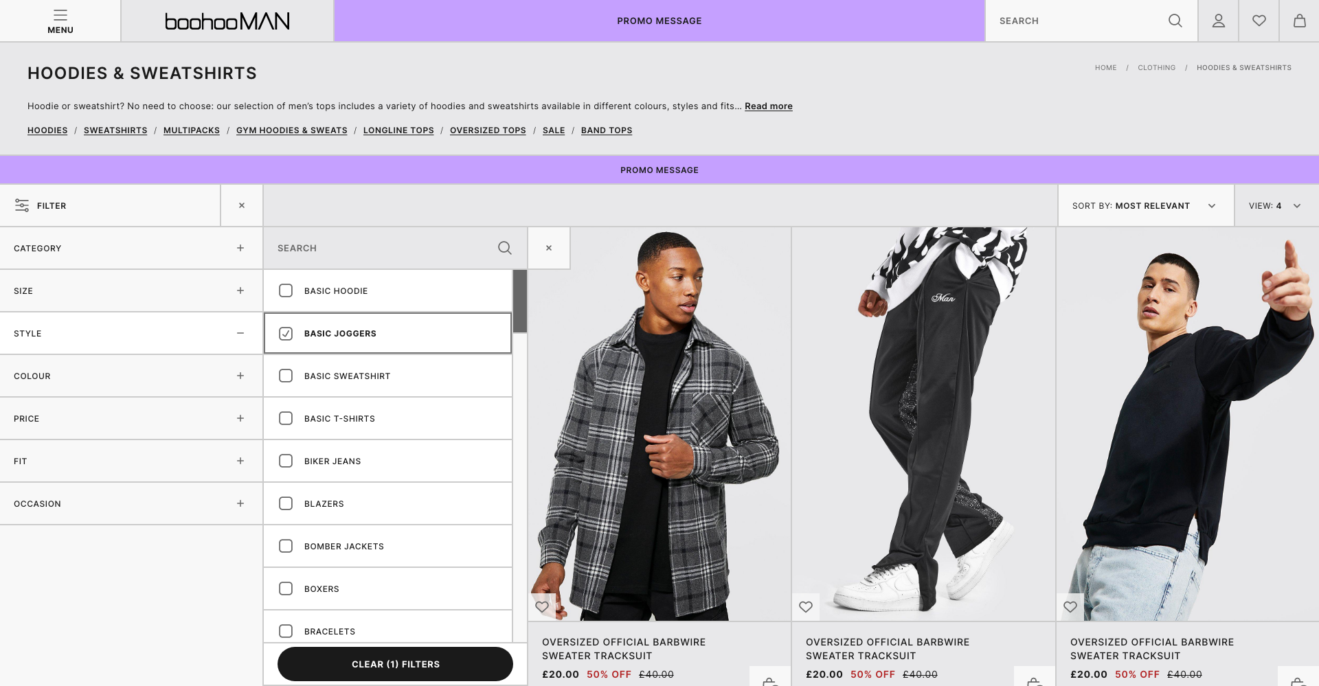
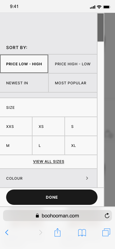
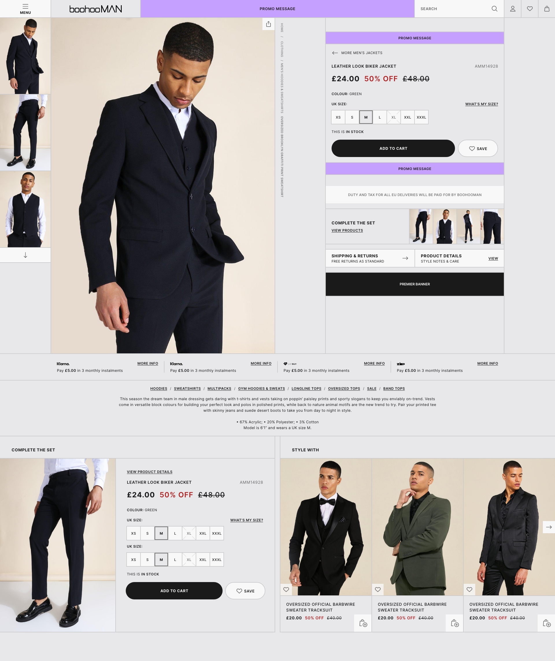
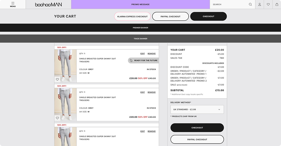
With a project of this scale, maintaining regular stakeholder involvement was critical—without slowing delivery. Balancing this was challenging, as stakeholders often had conflicting goals and competing feedback, and engaging each individually would have significantly slowed progress while creating further misalignment.
To address this, I introduced a structured communication cadence. I ran twice-weekly update sessions focused purely on sharing progress, outlining the design process, and flagging major risks or decisions. These sessions were not designed to gather feedback, but to ensure transparency and shared understanding.
Dedicated feedback sessions were held at the end of each week. These longer, more in-depth forums allowed stakeholders to raise feedback accumulated throughout the week, discuss trade-offs openly, and collectively prioritise changes based on impact and relevance to the overall design.
This approach was maintained throughout the entire project lifecycle, from early wireframes through to final UI and development-ready changes. As a result, late-stage changes were minimised, decision-making remained clear, and any gaps identified were the result of design trade-offs—not communication breakdowns.

Key solutions

Product listing Page

With fast fashion product listing pages increasingly blending into one another, differentiation on the PLP became a key UX challenge. At the same time, the business wanted greater flexibility to promote individual products without disrupting the browsing experience.
To address both needs, we introduced a pattern change that highlighted featured items within the PLP. This variation broke up repetitive product grids, creating visual rhythm and giving users a sense of progression as they scrolled, while also enabling the business to strategically surface priority products.
The result was a more engaging, less monotonous browsing experience that balanced discovery for users with commercial visibility for the brand.

Quick buy

Quick-buy functionality has become a standard expectation in e-commerce, yet it is often underused due to poor execution and its treatment as an afterthought rather than a core interaction.

This solution was designed to genuinely reduce effort for users. The quick-buy experience keeps users anchored in their current context, allowing them to dip in and out of the flow without losing their place or progress on the page. By removing the risk of disorientation or interruption, the interaction supports faster decision-making while preserving a sense of control.
Rather than restarting the journey, the quick-buy functionality was intentionally integrated to feel seamless—enhancing the existing browsing experience instead of competing with it.

Account page

Account pages on e-commerce sites often become purely functional spaces—places users visit to complete tasks rather than engage. Analysis showed that 95% of users accessed the account page primarily to track orders, yet users who engaged with their wishlist converted items 75% more often than those who did not.
The redesigned account page intentionally balanced these two behaviours. Order tracking was made as clear and concise as possible to support the primary user need, while increased visual emphasis was placed on wishlist items—particularly those on sale—to surface opportunities for re-engagement at the right moment

By reframing the account page as both a task-completion and value-discovery space, the design aimed to improve the overall user journey while increasing conversion from high-intent wishlist items.

Upselling

In fast fashion, upselling is a major commercial objective due to high product volume and low individual item prices. The challenge was to encourage multi-item purchases without relying on patterns that feel purely transactional.

Most sites approach upselling by stacking generic product recommendations at the bottom of the page, often with little relevance to user intent. This redesign reframed upselling as a discovery tool rather than a sales tactic.

By grouping items based on similarity and styling them together, the experience helps users build complete outfits or explore meaningful alternatives. This approach supports the business goal of increasing basket size, while also enabling users to find products that genuinely align with their taste and intent—creating a more balanced, value-driven upsell experience.

Result and impact

The full user impact of this project has not yet been measurable, as development was paused before the redesigned site could be released. From a delivery and alignment perspective, however, the project was successful, receiving full cross-functional sign-off from all stakeholders involved.

While the complete redesign has not gone live, elements developed as part of this project have already delivered measurable impact elsewhere within the group. The redesigned checkout experience, originally implemented on boohooMAN in late 2021, resulted in an 8% increase in conversion rate and a 20% reduction in drop-off, validating the design principles and user-led decisions applied throughout this work.

The intended next step was to collaborate closely with engineering to build and A/B test the redesigned experience. Although this phase did not proceed, learnings from this project have continued to influence other initiatives across the group. Insights and design hypotheses have been incrementally refined through related testing, ensuring the work remains relevant and performance-driven should development resume.
Reflecting on the project, the redesign delivered a significantly more brand-aligned and user-centred experience, with clearer purpose and functionality across all sections of the site. There were opportunities to push certain concepts further; however, stakeholder constraints meant some of the more progressive ideas were earmarked for future experimentation. In hindsight, the account area presented the greatest challenge, and with additional time, a more scalable solution for managing complex form-heavy interactions could have been explored.

Final designs

Homepage

Menu

Product list page

Quick buy

Filtering

Product display page

Basket

Account

New VS old

PDP

PLP